Minimalist Visual Identity For Margin Bookstore

Minimalist Visual Identity for Margin Bookstore abduzeedo February 09, 2026
Explore the minimalist visual identity for Margin Bookstore by The New Company. A design study on white space, typography, and editorial layout systems.
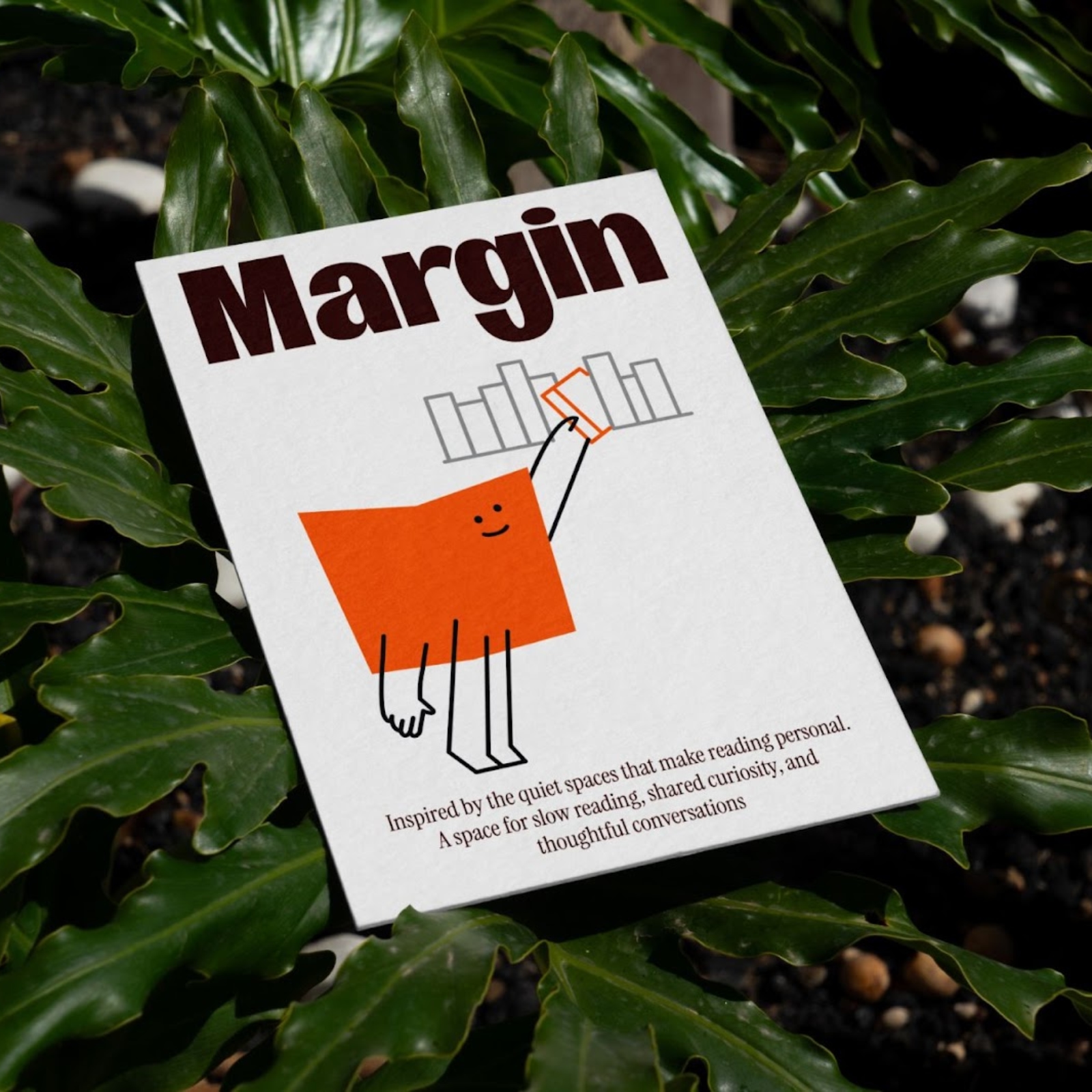
The concept of a bookstore often evokes crowded shelves and dense text. The New Company took a different path for Margin Bookstore. They focused on what stays off the page. This project uses the physical margin as a core design tool. It is not just a border. It is a functional space for thought and clarity. The studio identifies the "soul" of the brand through the lens of silence. In a world of loud graphics, this work speaks in a whisper. It relies on the strength of a sharp typographic system and the strategic use of empty space.
The primary visual solution is found in the grid. The New Company uses a flexible layout that mimics the experience of reading a well-set book. The logo itself acts as a marker. It sits at the edge of the compositions, framing the content rather than dominating it. This choice reflects a deep understanding of editorial design. The studio avoids the common mistake of over-branding. Instead, they let the typography do the heavy lifting. The chosen typeface is clean and functional. It works across print and digital touchpoints without losing its character.
A key detail in the PDF is the use of monochromatic palettes. By removing color, the focus shifts to texture and form. This choice aligns with the name "Margin." It suggests that the bookstore is a place for the edges of ideas. The stationery and packaging items show a high level of restraint. Business cards use deep debossing to add tactile value. This detail bridges the gap between the digital design and the physical store. The layout of the brand book itself is a masterclass in balance. Each page uses vast white space to highlight small, precise blocks of copy.
The design problem was how to make a bookstore feel modern yet timeless. The New Company solved this by looking at the history of the printed word. They took the basic elements of a page and scaled them to a visual identity. The result is a system that feels both academic and accessible. It does not try to sell books through flashy ads. It sells the idea of reading as a quiet, essential act. This work proves that the most impactful design often comes from what we leave out. It is a study in subtraction.
Designers should note the specific alignment used in the posters. The text often hugs the far right or left edges. This reinforces the "margin" concept in every application. This project shows that a strong idea can carry a simple execution to a world-class level. The New Company has created a visual identity that respects the reader. It is a quiet triumph of modern branding.
Credits: The New Company
Visual Identity
Popular Products
-
 Large Wall Calendar Planner
$55.76$27.78 -
 Child Safety Cabinet Locks - Set of 6
$83.56$41.78 -
 USB Touchscreen Heated Fingerless Gloves
$75.56$37.78 -
 Golf Swing Trainer Practice Stick wit...
$21.56$10.78 -
 Golf Swing Training Belt
$41.56$20.78