Not Just Animations, Microinteractions That Improve Ux

How tiny details build trust and make digital products feel alive
You click a Save button. Nothing happens.
No color change. No checkmark. No loading spinner. Just silence.
So your brain immediately asks one question. Did that actually work?
You click again. Maybe one more time. Just to be sure.
That three second moment of confusion is what happens when a microinteraction is missing. And it is a real UX problem that could have been solved with one small, thoughtful design decision.
What Microinteractions Actually Are
A lot of designers, especially early in their careers, think microinteractions are just animations. So they add bounce effects to buttons, make menus slide in with fancy physics, and call it a day.
That is missing the point entirely.
A microinteraction is not decoration. It is a communication tool. Its job is to tell the user something important in the briefest, least intrusive way possible. It says “yes, that worked” or “hold on, it is loading” or “that action is not available right now.”
Dan Saffer, who wrote the book Microinteractions Designing with Details, puts it this way. The best microinteractions are the ones users do not even notice they are using. You only feel them when they are broken.
Animations can be part of a microinteraction. But so can a color change, a short vibration, a sound, or even a single word that appears and then disappears. The format does not matter. The message does.

The 4 Parts of Every Microinteraction
Once you understand this framework, you can break down and design any interaction from scratch.
Trigger
This is what starts the whole thing. Either the user starts it by tapping, clicking, or swiping. Or the system starts it by receiving a notification, finishing a background task, or detecting a change in state. Knowing what the trigger is tells you exactly when to begin the interaction.
Rules
This is the invisible logic behind the feedback. When a user taps Like, the icon changes color, the count goes up by one, and the action saves to the server. You define these rules so your developer knows what to build. Rules are never visible to users, but they control everything.
Feedback
This is what the user actually experiences. A subtle animation. A small sound. A soft vibration on their phone screen. Visual feedback is the most common type, but it is not always the best one. Sometimes a single haptic pulse communicates more clearly than any animation could.

Loops and Modes
Does this interaction repeat? Does it behave differently in certain conditions? Think about a phone alarm. The ring is the feedback. The snooze is a mode. The fact that it goes off again tomorrow morning is the loop. Designers often skip this part, but developers always need to know it.

How to Find the Right Moments
Do not start by designing animations. Start by reading your user flow.
Look for every moment where the user takes an action or waits for the system to respond. Some examples to think about in a typical app.
A user types in a search bar. When does the autocomplete appear?
A user taps Add to Cart. What happens to the cart icon?
A user submits a payment. What does the loading state look like? What about the success state? What about the error state?
A user swipes to delete an item. Do they get a moment to undo it?
Each of these is a candidate for a microinteraction. You do not need to add feedback to everything. Focus only on the moments where a missing response would confuse or frustrate the user. Those are your priority.
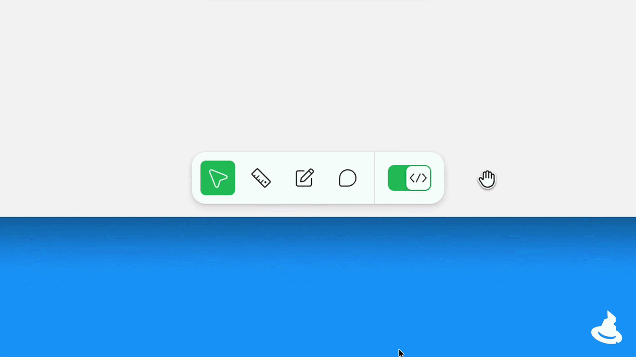
Execution and Tools
Building your prototype depends entirely on your goal. For quick ideas and team presentations, Figma Smart Animate is usually enough. For complex animations that will be handed off to developers, After Effects with Lottie export is still the industry standard. Rive is also growing fast because the file sizes are small and the animations can be embedded directly into production.
If you are on a Mac, you have access to some of the most powerful prototyping tools built specifically for microinteractions.
Principle is Mac exclusive and built specifically for mobile app animations. You can import your Figma files directly and create interactive prototypes with realistic gestures and button clicks. Its timeline makes it incredibly fast to design bounce, ease, and pop effects without writing a single line of code.
Origami Studio was built by Meta and is also Mac only. What makes it special is its support for native mobile behaviors like haptic feedback, gyroscope response, camera input, and device vibration. If you want to prototype a microinteraction that involves touch and feel, not just visual animation, Origami is the tool for that. Both tools are free to use and trusted by teams at Apple, Google, and Spotify.
The Golden Rules of Timing
No matter which tool you use, timing is what separates amateurs from professionals.
Feedback animations for things like button confirmations should last between 100 and 300 milliseconds. Below 100 milliseconds, the human eye simply does not catch it. Above 300 milliseconds, the interface starts to feel slow and heavy.
And never use linear easing. Objects in the real world never move at a constant speed. A door accelerates as you push it and decelerates before it stops. Apply the same logic to your animations. Use ease-out for elements entering the screen, ease-in for elements leaving, and ease-in-out for most transitions in between.
The Classic Designer vs Developer Debate
Here is the part design schools rarely teach you. For years, designers and developers have fought over microinteractions.
The designer creates a beautiful, complex animation in After Effects. The developer looks at it and says it will ruin the app performance, take three weeks to code, and add 50 kilobytes to the bundle size.
This was the reality of production constraints. Designers wanted the app to feel alive. Developers wanted the app to load fast and not crash.
So compromises were made. The beautiful three part animation became a simple color change. The physics based bounce was replaced with a standard fade. Not because the developer was lazy, but because building custom motion logic from scratch was expensive and hard to maintain.
When designers had to defend a decision, they had to argue with user behavior, not aesthetics. Saying “this animation looks better” never worked. Saying “user testing showed people clicked submit twice without visual feedback, which creates duplicate database entries” worked. That is a business argument.
But this dynamic is changing completely.
The AI Era Makes the Impossible Possible
This brings us to where we are in 2026.
The old debate about engineering effort is disappearing. With AI coding assistants and generative UI tools, building complex microinteractions is no longer a technical nightmare.
If a designer wants a button that reacts to the speed of a swipe, or a background gradient that breathes while the system processes data, an AI assistant can write that exact React or Swift code in seconds. What used to take days of custom math and physics coding is now just a well written prompt.
AI makes the impossible possible. It removes the technical friction that used to kill great microinteractions.
More importantly, AI allows these interactions to be adaptive. The system can now generate different feedback based on who the user is. A returning user sees a quick, confident transition. A brand new user gets a slightly longer animation guiding them to the next step. The same trigger, but different feedback based on context.
This is a massive unlock for designers. The feedback is becoming smarter, quieter, and more human. And it is opening up a new category of product differentiation that most teams have not even started exploring yet.
Where to Find Good References
Do not rely on Dribbble alone. The work there is often too polished and too impractical for real production.
These are the most useful sources for real world microinteraction reference.
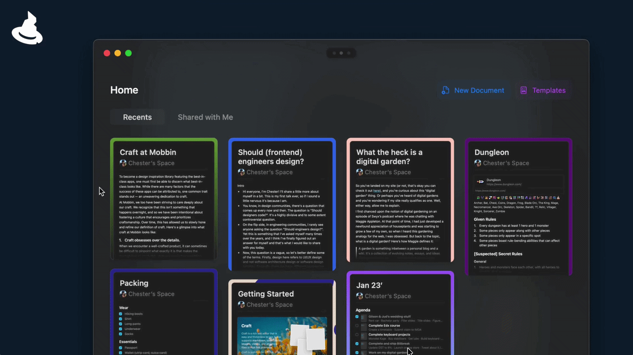
Design Spells is a beautifully curated collection of magical design details. They highlight the tiny, delightful microinteractions from real products that most people miss. It is the perfect place to see how top tier products add charm to their interfaces.
Mobbin collects screenshots and recordings from actual live apps. You can see exactly how Spotify, Airbnb, and Linear handle state changes and feedback in their real products. This is far more useful than any concept post.
Material Design from Google and Apple Human Interface Guidelines both have detailed motion documentation. They do not just show you what to do. They explain why. Reading these will help you build the reasoning behind your design decisions, not just copy the output.
What Good Microinteractions Feel Like
When microinteractions are done well, users do not comment on the animations. They say things like “this app just feels smooth” or “I always know what is going on when I use this.”
That is the goal.
Features can be copied. Any team can build a to do app or a checkout flow. But the way a product feels when you actually use it is much harder to replicate. The quiet confidence of a well timed confirmation. The small reassurance of a checkmark after you submit a form. The sense that the interface is paying attention to you.
Microinteractions are how your product earns that feeling.
The next time you are deciding whether a button needs an animation, remember you are not making a visual decision. You are making an emotional one.
And emotions are what make users come back.
References
- Nielsen Norman Group
- Micro Interactions Why, When and How to Use Them
- Micro Interactions a designer superpower
- How micro interactions have become an essential part of great products
- Micro Interaction Muzli Design Inspiration
- 5 pro tips for better micro interaction design
- Design Spells
A Little More About Me
Hey, I’m Dani. As a Product Designer, I simply want to share what I’ve learned, hoping that this knowledge will be passed on and that the goodness it brings doesn’t just stop here with me. My aim is for these insights to keep spreading and helping others.
If you found this post helpful, you can support me by clicking the clap button. Find me on other platforms Dribbble | LinkedIn
Thanks for reading ????
……
???? Stay inspired every day with Muzli!
Follow us for a daily stream of design, creativity, and innovation.
Linkedin | Instagram | Twitter


Not Just Animations, Microinteractions That Improve UX was originally published in Muzli - Design Inspiration on Medium, where people are continuing the conversation by highlighting and responding to this story.
Popular Products
-
 Adjustable Shower Chair Seat
$107.56$53.78 -
 Adjustable Laptop Desk
$91.56$45.78 -
 Sunset Lake Landscape Canvas Print
$225.56$112.78 -
 Adjustable Plug-in LED Night Light
$61.56$30.78 -
 Portable Alloy Stringing Clamp for Ra...
$119.56$59.78